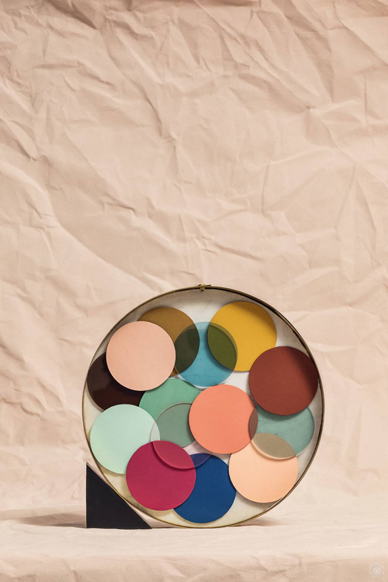
Blog Subjectivity of colour
10 July, 2017
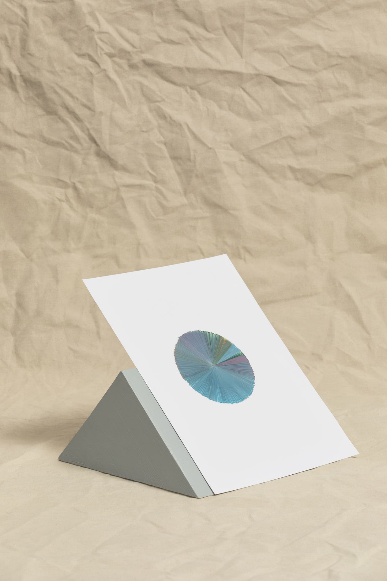
For a feature in Disegno #14, 11 contemporary designers and artists were inited to take a simple colour test. Devised by the Bauhaus master Johannes Itten, the test was designed to reveal a person’s subjective colour preferences.
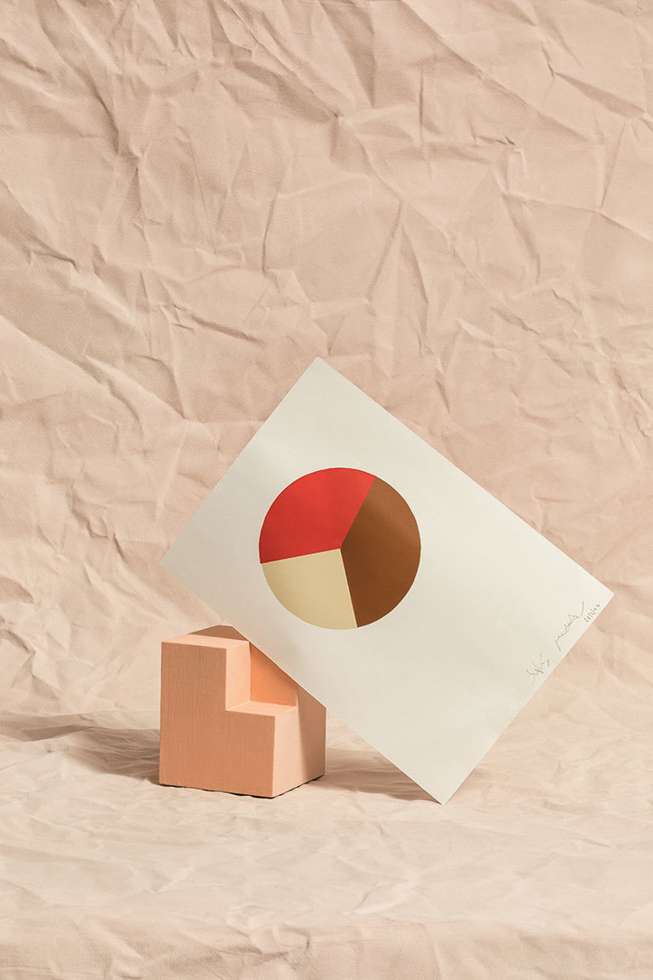
In 1928, art students at the Itten School in Berlin were set a new exercise. The school’s founder Johannes Itten (1888-1967) had asked his students to paint preset colour combinations within circles, but unrest soon set in. “We all think that the combinations you assigned are not harmonious,” Itten remembered the class telling him. “We find them discordant and unpleasant.”
Itten, a former Bauhaus tutor and one of the 20th century’s leading colour theorists, was surprised by the discontent. In response, he gave his students license to paint whatever combinations they found harmonic. “After an hour, I had the finished sheets spread out on the floor for inspection,” Itten wrote in his 1961 book The Art of Color. “Each student had painted several original, closely similar combinations of his sheet. But each student’s work was very different from the others. It was realised with astonishment that each had his own private conception of colour harmony […] This is subjective colour.”
This exercise in subjective colour forms only a small portion of The Art of Color, but its implications were far-reaching. “Any suggestion that subjective colour may reveal character or mode of thought and feeling should be avoided,” cautioned Itten, but he nonetheless acknowledged the significance of his findings for practitioners. “[Designers] sometimes tend to be guided by their own subjective colour propensities,” he wrote. “This may lead to misunderstandings and disputes, where one subjective judgment collides with another.”
Itten called for sensitivity to individual design challenges. “For the solution of many problems […] there are objective considerations that outweigh subjective preferences,” he wrote. A butcher’s shop should be decorated in colours that emphasise the redness and freshness of the meat; a Christening requires flowers in light, delicate shades; spaghetti packaging ought not to be designed with blue polka dots, for the “form and colour features are in conflict with the theme.”
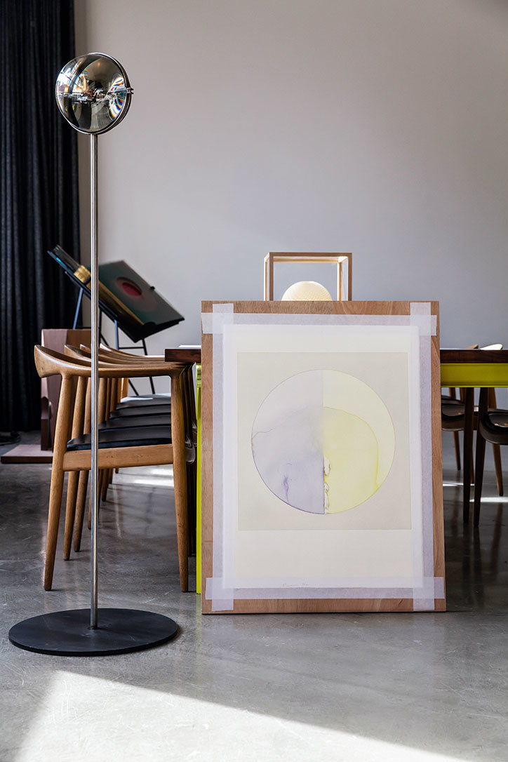
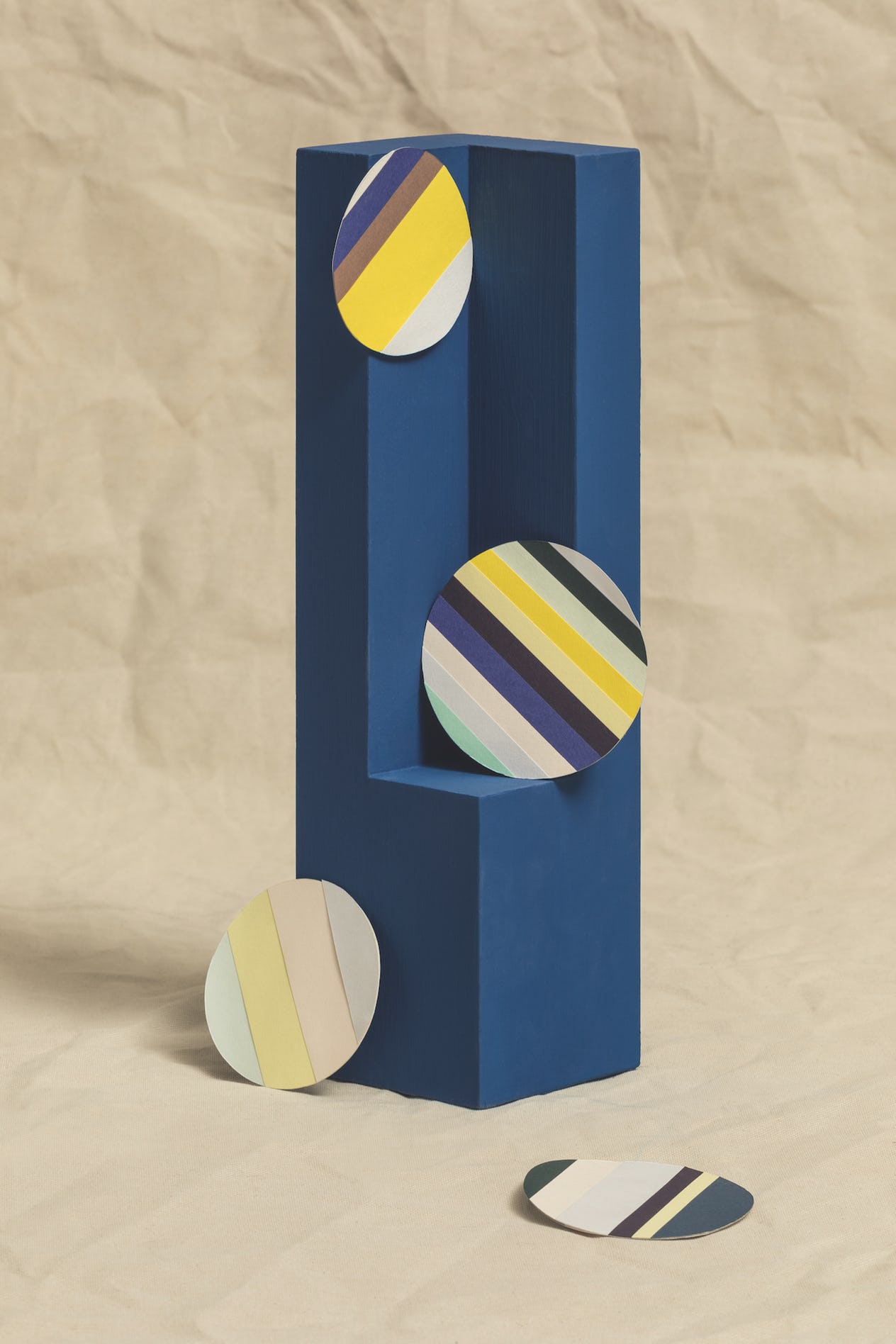
March 2016 marks the 50th anniversary of Itten’s death, but his observations around the relative objectivity and subjectivity of colour remain vital to designers. To mark Itten’s contribution to the field, Disegno invited 11 contemporary designers, artists and architects to take Itten’s original test. The resultant artworks, curated across the following pages by the Milan-based design practice Studiopepe, display the complexity of any creative practitioner's relationship to colour.
Source: Designo

 Facebook
 Twitter
 Pinterest
 Google Plus
 Stuur naar vriend(in)